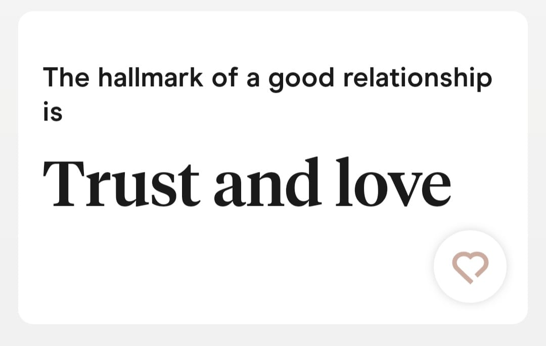
There are two fonts here, first is non-serif and second is serif.
The non-serif one, is extremely close to Arial. The a tiny difference I found was on “r”, where it’s terminal is little different. Can you identify which font it is?
The serif one, when I looked closely, it is looks like Time New Roman, but it isn’t. Its terminal of “r” is different than Times New Roman. Can you identify which font it is?
(The picture is from Hinge dating app)
The Serif font is Tiempos (Headline) Tiempos Headline fonts · Klim Type Foundry.
The Sans font is Modern Era https://familytype.co/#modernera.
You can browse the font names of any website by “inspecting element”.
1 Like
Opinion about these fonts used for this purpose?
I think that tiempos is really versatile. To me, it´s a perfect substitute to Times New Roman. Check out these two wonderful book designs with Tiempos as main font: https://fontsinuse.com/uses/2308/malcolm-gladwell-collected and https://fontsinuse.com/uses/16256/the-murder-of-art-by-thomas-crombez.
By the way, I am spanish and I can tell you that the most selled newspaper of Spain used Tiempos for their weekend magazine for some years. In this link you can view some images: El País Semanal · Fonts in use · Klim Type Foundry.
Ok… When I Looked at Heading font I felt odd… I thought that since this is dating app, font should also reflect that. In “the Elements of Typographic Style” book, at the beginning some explanation is given to this topic, where how romanticness can be seen in each letter. For example, “e” letter, if it has more openness (or maybe aperture), it characterizes romanticism and etc. About the sans-serif, the sand serif is also not correct. Its like Arial, with very minute difference.