On my recent customer survey, I heard from a lot of people who wanted me to create a new monospaced sans font, in the vein of Consolas or Menlo. I know what you mean. But aren’t there a lot of options already (and many of them free)? What can I bring to this genre that you haven’t seen before?
Hello Matthew, and thank you for the forum invitation.
I guess the reason I asked was not because Triplicate fails some sort of usability test. Rather that I wanted something that would read to a third party as “this is a monospaced font of the sort that conveys ‘text on a computer’.”
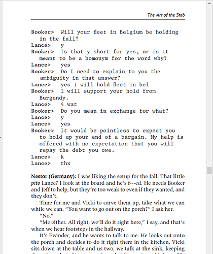
I’ll give you an example. Here is a page from my novel. You can see the Concourse in the header, and at bottom, Valkyrie for the regular text.
In between is a conversation carried out over smartphones, in Triplicate:
If this were a court transcript, this would work. It doesn’t fail to convey “conversation over smartphones”, exactly, but a monospaced sans would have worked better.
I’ve since downloaded Ubuntu Mono (licensed under SIL Open Font License), and that’s okay and so is Consolas, but I was hoping for something more old-style computer terminal, slightly less rounded and slightly more squared-off? If that makes any sense?
I’ve been a programmer for 25+ years. I’ve had a good spell on Courier and variants, but when Adobe released Source Code Pro, I switched and didn’t look back. I gave Triplicate a whirl but found it too ornate–it got in the way of coding, much the same way that most syntax colouring schemes look like the Vegas strip when you first turn them on (I’ve reduced all of my syntax colouring to four colours: something close to background colour for comments; strings; and a darker and lighter variant of another colour for general and keywords, respectively).
My typographic priority for all coding now is quietness. After Source Code Pro, I spent time with San Francisco Mono and ended up on Roboto Mono, which has had the longest run now. It never calls attention to itself, it just feels harmonious and straightforward, and the simplest presentation of what I’m trying to write.
A couple of thoughts:
I wanted to add Triplicate to my collection numerous times already. I need (I want?) a unique monospace font for parts of my briefs. The reason why I haven’t purchased Triplicate yet for this very application sounds very silly: Some characters or parts of some characters look (are?) slighty slanted. Like the “t”, the “e”, the dot (!) on the “i” and so on.
I appreciate the overall design and philosophy behind Triplicate (recreating old Typewriters) and I would love to use it if I were a screenplay writer for example. But in my court documents (90% Equity, 10% Concourse), Triplicate to me looks a little bit “off”. It never occured to me, that a sans serif Triplicate could remedy my concerns, but now the more I think about it, it very well may.
fatbird’s description (“too ornate”) is a little bit harsh, but I agree in regards to my specific application.
“What can I bring to this genre that you haven’t seen before?” - Your examples (Consolas, Menlo) and other sans monospace fonts seem so contemporary for a lack of better word, like the Comic Sans of the Future (I exagerate of course). I trust you can create a typeface that feels/looks like it was used on the earliest of monochrome CRT screens as well as on sophisticated, high resolution holographic displays of future spacecrafts in which we will explore our galaxy.
I understand why Triplicate may not fit the bill in every case. But Triplicate (deliberately) occupies a small, contrarian niche in the field of monospaced fonts. For all the fonts in my library, I like to be able to say “there is no other family that does X.”
The idea of something based around early-era terminal fonts is appealing to me, for the same reason Triplicate was — those alphabets were so idiosyncratic and tuned to the hardware. These days, most monospaced sans fonts are really proportional sans serifs that have been stretched / shrunk over a monospaced frame. That’s fine as far as it goes, but it represents what I would call a top–down way of approaching the issue, rather than bottom–up.
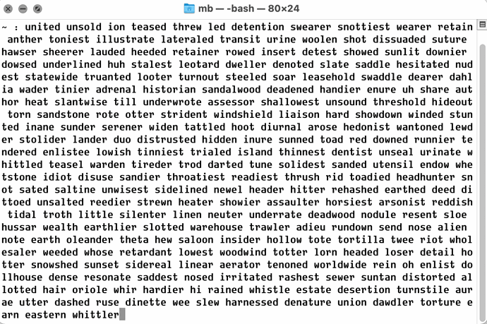
I did a version of the VT220 font for a project a few years ago. I also like the original IBM PC font and Macintosh menu font (Chicago). One unusual shared characteristic of these is having thicker vertical than horizontal stems. For instance, here are some sample characters in that style. An idea that deserves to be re-examined? Or permanently left behind?
I can only speak for myself, but yes, the version of the VT220 font that you show is the sort of thing that I would be interested in.
Of course, if there is already a pretty good version of this with a reasonable license I can use for books, logos, etc. there’s no reason to reinvent the wheel. But I personally would be interested in something like this.
It depends on the purpose of the font. If it were made for professional programmers, I’d like to see another font that have a similar character height proportions as Lucida Console. Lucida Console’s huge x-height and “short” capital letters makes it okay for me to program in a smaller font size than any other fonts. This means more lines can be displayed on the same amount of space with sacrificing legibility.
More lines in the same space may not be a good practice in normal typography. But when you look at the terminal all days like many professional programmers, you’ll really be annoyed by having to constantly scroll the terminal.
To the best of my knowledge, Lucida Console is about the only monospace sans that has short capital letters. BTW, it also has a somewhat high contrast so you may want to take a look at.
I agree that Triplicate is too pretty for coding. I find it too distracting. Something along the lines of Pragmata Pro (condensed, sans, squareish …) but with an mbutterick twist would be interesting. Actually, just take my money.
I am surprised to see this post, I guess my feedback was in the minority.
I love Triplicate and have been using T3c in IDE and terminals across all machines for more than a year now probably. It’s the first actual serif monospace font I use for this purpose and I find it extremely legible, letter proportions are spot on (though I do configure denser tracking), etc. Serif features get out of the way and I just don’t notice the font.
I don’t really need any other fonts, but if any further work goes into Triplicate (expanding character coverage? more variants?) I’ll certainly appreciate it.
I aim to expand on my “another sans-serif monospaced font, maybe, please” survey feedback at a later date, but I wanted to sign up to chime in and say that the conceptual space around Chicago and the VT220 font is very much worth poking around. I’ve always liked Kare’s Chicago.
My only worry is that things in this space wouldn’t go all that well with any of your other faces, especially the one I’d be most likely to use myself for long-running body text in either light mode or dark mode (Concourse). I’m not sure how to square that circle, or even if that circle is squareable.
While I am currently using Triplicate as my coding font-of-choice, I have only been doing so for a year, and typically rotate my coding fonts every two to three years.
I’ve been programming full-time for fifteen years (and a font nerd since playing with Print Shop Pro in fourth grade), and before Triplicate my coding font was Dank Mono. A thing I think both fonts share in common is a sort of distinctive character, but where I think it helps Dank Mono is in distinctiveness between characters.
Pretty much anyone who’s touched a text editor for technical purposes appreciates the features of a typeface that help distinguish 0 from O, 1, l and I, and many coding fonts understand the importance of this, for these characters. Dank Mono goes far, far beyond this in helping distinguish other similar characters such as f and t for example, and in such a way as to maintain its individuality.
I love Triplicate as a font (and use it on my website for code), but with code it sometimes feels a bit …off. Part of it might be the association of non-sans monospace fonts with other media involving typewriters, and part of it might be that my 4K screen isn’t truly “retina”-grade, but I’ve been considering switching back to Dank Mono because it feels more “right” for code.
The following site usefully gives you a way to test drive many (currently 112) mono fonts:
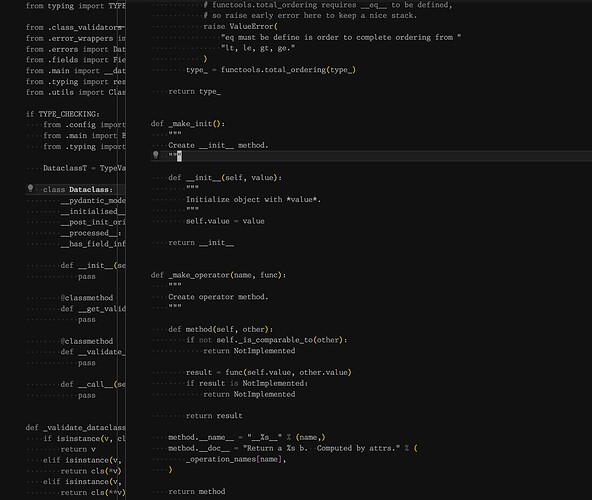
There are some interesting ones there. Some that stood out to me as potentials for “conversation carried out over smartphones” use:
- B612 Mono - designed for use on aircraft cockpit screens
- BigBlue Terminal - " It follows the metrics and dimensions of Windows’ old Terminal font (at the 9pt/12px size), but the appearance is closer to the classic IBM PC text mode character sets."
- Cartograph
- Courier Prime - an improved Courier designed for screenplays; includes a sans and code version
- Cozette - a more retro, bitmap, 8-bit computer vibe
- Drafting Mono - a beautiful mono from Owen Earl - variable, italics, and small caps, which I’ve not seen before in a mono. It’s not sans, though.
- Fairfax - another bitmap font
- Fixedsys - the 1980s classic from Microsoft
- Iosevka - a vast family - check the website
- Share Tech - squared-off, bitmap look
- Spleen - another squared, computery bitmap looking one
- VT323 - “created from the glyphs of the DEC VT320 text terminal”
This isn’t on that site, but might also be of interest:
Thanks for this – there should be something here I can use; let me sort through them.
@mbutterick your original question, “What constitutes a good monospaced sans?” really depends on what you want to use it for.
If it’s coding, JetBrains Mono site provides some rational, objective pointers.
I personally favour Cascadia Code from Microsoft for coding and terminal use because I like the functional but slightly chunky, quirky style. It seems many programmers like something that is “functional but with a bit of personality”, while others prefer something tidy and inconspicuous. I have used JetBrains Mono a lot too and appreciate its quiet functionality. Hack is another one that is carefully designed for code. It is a fairly neutral design with just a touch of added flavour.
For other uses, I like the Courier Prime family, the epic Iosevka, Cartograph, Ellograph, Drafting* Mono, Input, Victor Mono, Azeret, and Space Mono. Sorry, I’d provide links but the forum won’t let me yet.
Update: forgot to mention Recursive (www.recursive.design) too.
An interesting iteration of Source Code Pro can be found in Office Code Pro. The changelog in the readme describes the updates. I like this a lot. It look a little calmer (e.g., the lowercase g) and tidier than the original.
I came here and indeed signed up for the forum after reading the rest of this thread specifically to call out Hack as roughly the platonic ideal of a neutral monospace sans type designed specifically for coding. It is not high on character, but for that purpose that is an upside. (It also means that it pairs nicely with almost everything! But it is not distinctive.) For my own monospace uses in general, Triplicate has too much character, and I’ve never quite managed to find a place where I would deploy it.
Thank you for the links—many of these fonts I’ve seen; some I haven’t. Though I’m afraid I remain unpersuaded that there’s terra incognita in the realm of “neutral monospace sans”—my impression, confirmed in this thread, is that there’s already a ton of options, and better still, most of them are free.
Triplicate was never going to be to everyone’s liking. But everyone can at least understand the concept and what makes the face distinctive.
At root, that is my question here: not just what constitutes a good monospaced sans, but in particular, what territory remains unexplored.
I agree the neutral coding font is a well explored and well provisioned area.
Programmers are unusually cognizant and passionate about the monospace fonts they use. This isn’t surprising given the time and intimate intellectual space we spend with them. This is also partly about tribal signalling – the laptops we carry, the stickers we place on them, our choices of software and languages, text editor, syntax colouring, tabs or spaces, and fonts (including “cool” ligatures) all contribute to the story of who we are, just like the clothes we wear. This, I believe, is why we see quite a few “interesting” coding fonts, and the recent trend towards use of elaborately cursive variants (example). It’s the equivalent of leather jacket, skinny jeans, and a rock ‘n’ roll t-shirt.
Just as we have seen with open source software, we see much of the same personally driven itch-scratching with fonts. The result: a broad and often well-crafted selection of libre coding fonts for various tastes and tasks.
So, yes, while the neutral coding font is a well explored territory, and I’m not sure if there are any worthwhile unexplored areas left, there could be scope for something both code oriented and “interesting”. But I can’t be sure. Being old and boring, I personally tend towards the pipe-and-slippers of a good neutral face.
Your VT220 font looks a lot like DJR’s Input and he has pretty much exhausted that look with san/serif mono/proportional variants. you can even customize the line spacing. so, i think that terrain is pretty well pulverized. I also find Triplicate to be too ‘busy’ (?) for coding, but I realize that is not really what it is intended for. I adapted a play for a Christmas reading a few years back and used Triplicate for my ‘script’ and it worked perfectly. What Source Code Pro does that I find calming is employs a LOWER x height. If you have shorter capitals and a high x-height, it starts to look like baling wire. The lower x-height and the spacing around the letters just lets Source Code breath. It doesn’t have a lot of character but that is good if you are looking at this stuff all day long. Operator mono is my new favorite tho, but i won’t go into that except to say that part of what i like is that it is intentionally quirky - especially in the italic - where it needs to be distinctive so that it stands out in the fixed slots that mono-spaced fonts are constructed in. Hack is just Source Code with a few tweaks. I think the untried ground is something like Electra as a mono-space. It’s futuristic in a 1930’s sort-of-way, it is a little different, it is stripped down to some extent - which you have to do with mono-spaced fonts, and I don’t think it has been done. Plus, the italic has some of the quirkiness that is needed in mono-space. I would buy that in a heartbeat…
I hope I’m just half mad with insomnia and fine rum, because I thought you said you LIKED THE CHICAGO FONT!
I’ve always respected your expertise and taste. Now I don’t know what to think ![]()
For me, Chicago is the definitive rebuttal to the Steve jobs cultists who get going about jobs’ refined aesthetic as evidenced by his study of calligraphy and fonts so everything would always look elegant (of course this was in reality the work of his designer Jony Ive).
I just show a specimen of Chicago and drop the mic.
Are you able to explain your feeling for this font? I’m not likely to become a full-on fan, but maybe I missed something.


