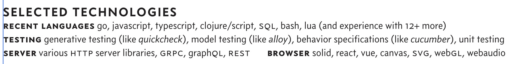
For various reasons, I’m updating my resumé, and as a technology worker this often means putting words like “REST”, “GRPC”, “GraphQL”, “SolidJS”, “SVG” and whatnot on the same lines next to each other.
If I were like most people in my field, I’d just use all-caps for these things and set it in whatever the default font was and call it good. I’m not. I sweat the details in my work, and want to set these elegantly in my resumé as well.
I’m using Concourse and Valkyrie for my resumé, and am already using small caps in various roles, but wanted to see what other people in a type-nerd-oriented community might think of this. This is what I’ve settled on as a sort-of “least worst” but would appreciate hearing people’s thoughts
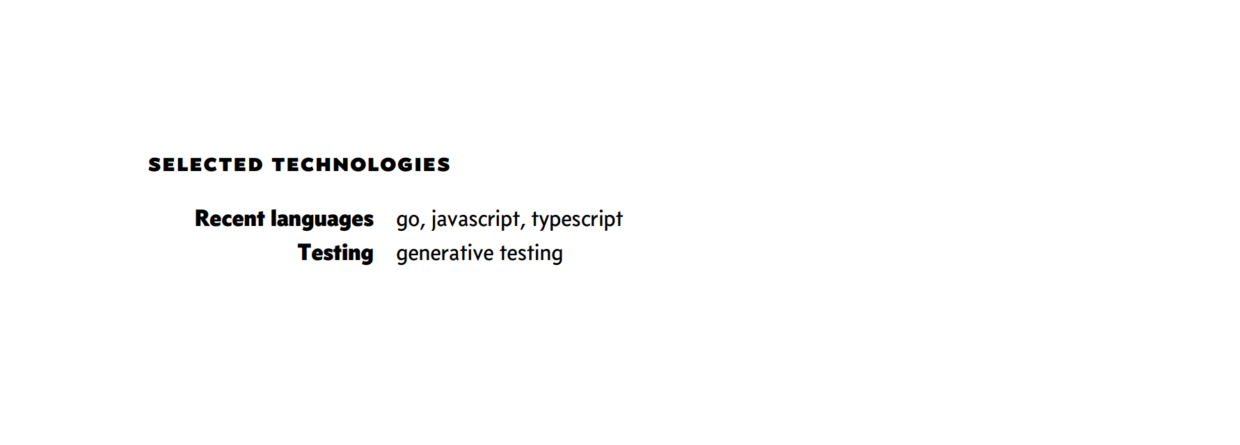
Sorry for replying so late, it´s been a busy week. IMHO “Selected technologies” is too big in comparison to the rest of the text. I´d reduce its size a little bit. Look, I made a small test for you in 5 minutes. I can email you the Word file so you can play with it if you wish. I´ve made a small table and I´ve hidden all the rules and borders. I´ve also aligned the “Recent language” to the right, and I think that it looks more neated. If you don´t like those fat letters, just reduce em to concourse 6 o 4. Hope it helps!
By the way, I think that choosing concourse for a technological cv is superb. Tschichold used to say that the sans is the font of the new world, the world of the engineer!
In the PDF you can see the rules of the table that are hidden on the image.
testcv.pdf (51.1 KB)
I think the line-length is too big in his case.
so I didn’t establish some context here:
- I did a lot of desktop publishing work back in the nineties/early 00s
- I’m already using Concouse/Valkryie to set my website, and have used Concourse for the typography both on a self-released music single and electronics hardware I’ve designed, I’m more than familiar with how good they are

- This resume in particular is meant to be a one-page summary of a twenty year career in technology with an intended audience of exec-level decision makers I’ve had previous contact with (as opposed to front-line recruiters), and my screenshot loses the context of being part of a page dense with text; breathing room is great but this particular section is meant to hit some keywords. “Selected Technologies” here is already down to 14pt, at this point if I made them smaller I’d pretty much have only my name above that size. Which may well work.
- This sample was from an iteration where I had removed a fourth line, “AudioVisual” in the name of space and I’ve since decided to put it back as it does help my particular case.
Anyway I had originally (last time I updated my resume) set the technology items text in Concourse as opposed to Valkyrie which is used for summaries/bullet points in the rest of the document, I believe to set the list items apart from everything else because it’s a unique section. I’ve since moved it to Valkyrie and eliminated the small caps and am happy with how it looks.