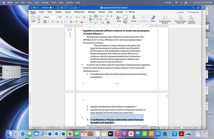
Matthew, I am confused with the format of the headings you recommended, which I will outline below:
-
When avoiding title case and all caps in the headings, does this apply only to sentence headings?
-
Because I found it awkward to write headings shorter than one line, such as “Provider rights and obligations.”
And if I am allowed to aspire my thoughts here, my current practice is usually consisted of three headings level, with each having its use case:
-
The first and second headings on documents tend to be shorter than one line; title case is always used.
-
The first heading summarizes the entire section of the argument; the second heading is to split the contexts for easy digestion.
-
Use third headings only for sentences that should be written in sentence case.
I am by no means a professional, but I want to improve my writing aesthetics. I have been learning a lot from your book and would like to hear your thoughts.
