I’m new here and not a designer, but I found Mr. Butterick’s site because I want to do a good job with this task I’ve been given.
My kid’s junior high was asking for help to create a program / bulletin for the public school’s orchestra concert. I’ve been reading over Practical Typography but I have no experience and no budget; I just have a computer and MS Word & Pages. But it’s one of those things that wasn’t going to happen if I didn’t do it, so I figured amateur > nothing.
There are several levels:
Top level (after the cover) is the ensembles. (Full Orchestra / Jazz / 6th / 7th / 8th).
After that is the timing: “classic” or “modern”
And then the name of the piece, the writer of the piece, and any soloists.
I’ve been looking at the “resume” as a possible template with the different levels but I’d appreciate any suggestions. Sorry I’m new to this, I appreciate your help if you can.
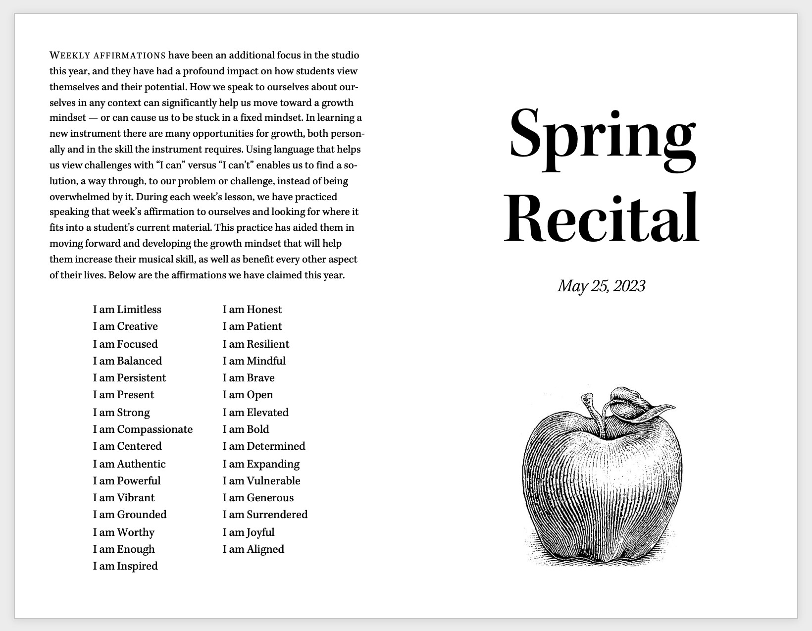
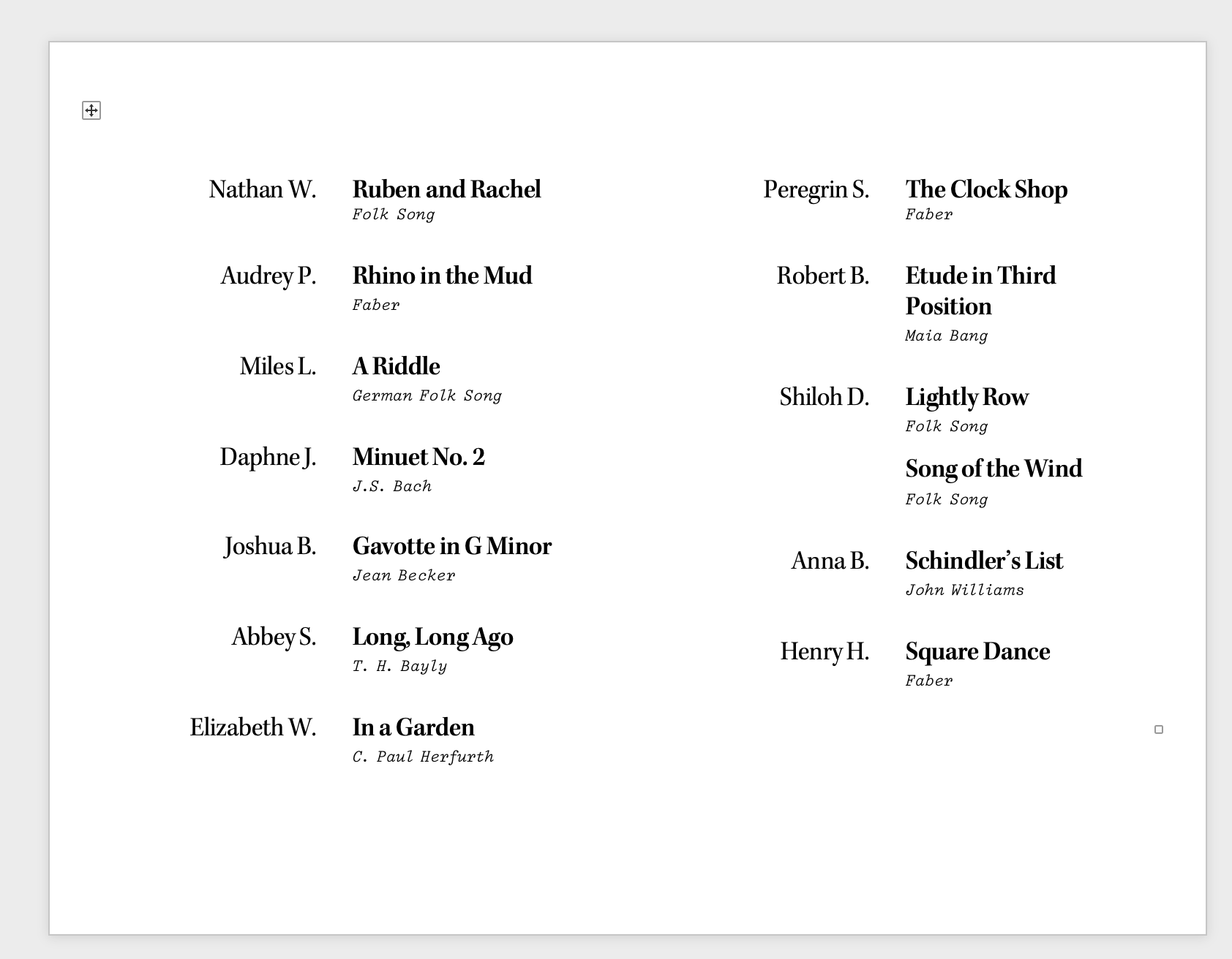
My wife has a violin and piano studio, and recital programs are my job. Here’s the approach I use to make a program that fits on a single 8.5"⨉11" paper folded in half like a booklet.
Create two separate Word/Pages documents, one for the front and back cover, and one for the inside of the program. (You could do them all as one document, but when fiddling with stuff sometimes overflow or other side effects from the first page break the formatting in the next, so I find it simpler to keep them separate.)
In each of the two documents, set the page to a 2-column layout in landscape orientation.
In the front/back cover document, the left column is your back cover and the right column is your front cover. In the other document, the left column is the left inside of the booklet and the right column is the right side (as you would expect). Further down are some screenshots to help explain.
For the inside document, create a two-column table that flows across the two columns. You can see the example below.
I make heavy use of the “Styles” feature to create separate styles for, e.g., “Performer”, “Song Title”, “Composer”. I tweak the line spacing, font weight/style/size, top and bottom margins, alignment etc. on the style, rather than on the individual paragraphs. This keeps everything absolutely uniform and makes it much easier to make changes.
I print one of the documents first, then place the printed one back into the printer feeder tray such that when I print the other, I end up with a two-sided booklet that I can fold in half.
Another method is to convert both documents to PDF and merge them into a single PDF, then use the double-sided printing feature on your printer (set to “flip on short edge”) to print them all at once.
If you have time and patience, use a hard plastic object like a paper folding bone to set the creases after folding each program.
The results aren’t going to blow anyone’s mind, but they look nice and uniform, and a step up from the typical amateur first effort. I also like to try out different designs and fonts for each recital.
Below is an example from our most recent recital, lightly-edited to remove full names. The fonts in this case. are Kepler Std and Triplicate B Poly. If you message me I can email you a copy.
I recently helped to create a flier for a 6th-grade Halloween party.
I used Matthew Carter’s Sitka typeface, which offers many display sizes. Sitka’s hinting had help from the good folks at Tyro Typeworks.
Sitka is good for fliers and e-mail.
For running text, I use STIX Two Text & Math (also from Tyro Typeworks, with sponsorship from the American Mathematical Society, Elsevier, IEEE, etc.).