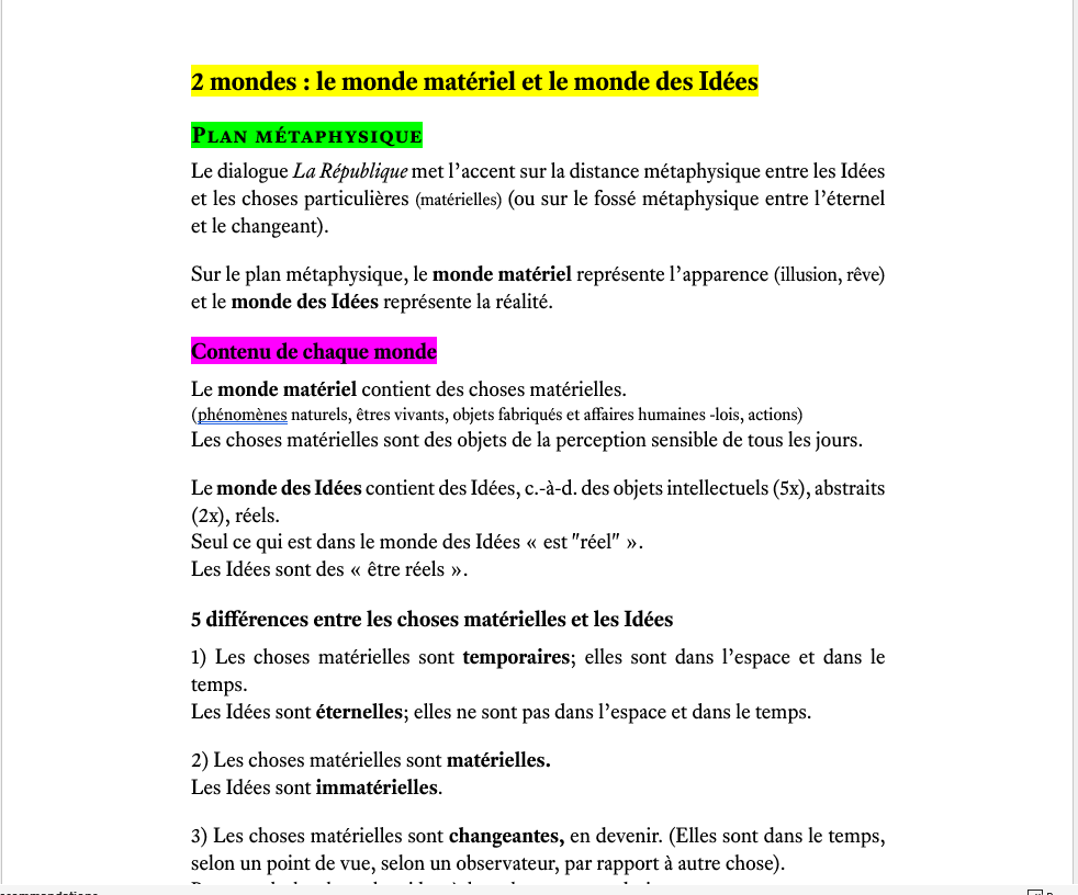
Hi, i just bought the “Equity” font and i love it!
I did a philosophy article in which i put 3 levels of headings (the big headings in yellow, then another level in green, then another level in purple).
I decided to use capslock only for the 2nd level but it’s not very coherent.
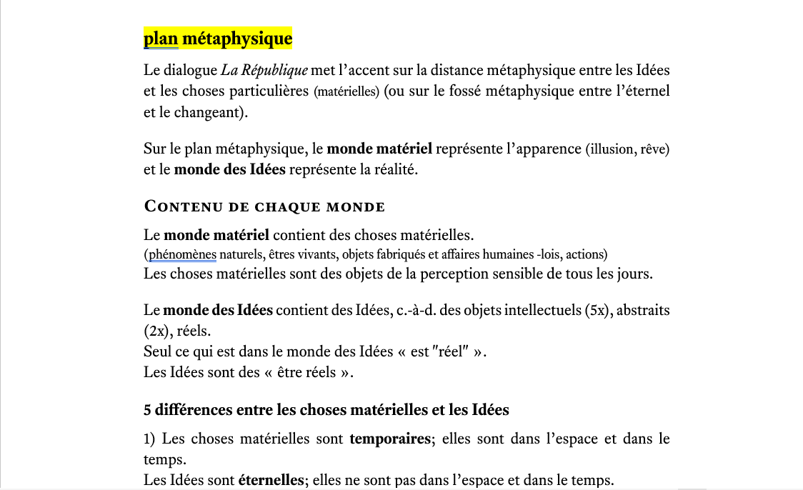
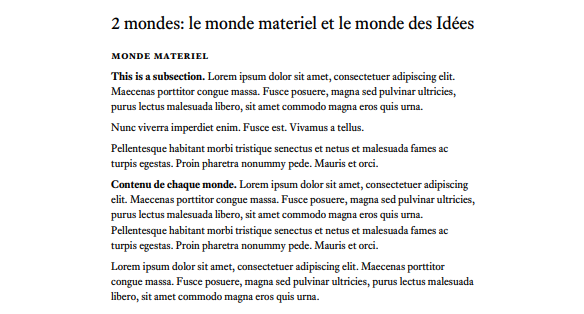
I was wondering what size of font i should use for each level and if i should use capslock for each level in order to have a better layout.
I tried also this version:
Thanks in advance if you have ideas,
Julien


