What does screen ScreenSmart mean v any other style/package?
would ScreenSmart print well v multi purpose package?
What do you print with and on? That for me is limited to what my office provides.
I always convert my docs to pdf to have a pdf copy. I don’t know if my pdf settings are correct. I just use the reg settings in Adobe Acrobat Pro.
Thank you. Do you know what headliner and poster styles are for fonts? I keep seeing them in some fonts.
I will play with them.
Also, I just downloaded a free trial of Jan Fromm – Capito to see how a prof font looks in Word, and there is definitely a difference. It is interesting when you read on the page where you buy about updates to the font. I also don’t know why more fonts do not have a limited free trial to see the font in use on your particular medium.
Also what is your thought on Old Style Figures and do you know how to switch to lining?
Capito is default Old Style but says it has lining. I just don’t know how to switch. I do prefer lining v old style and that is maybe because I am not used to number having descenders and ascenders, if I said that right. I do like the fact that it is $100 for the font with free updates. It is interesting to see a font that has updates. Wonder if those are push updates or check for updates. It is also not much different from Rooney Pro, other than Rooney is a fully developed font.
I say it is not much different because my eye is not trained to see the differences. To me they are almost identical. But, discerning the differences, basically what makes MB like Callisto but put Bookman in the D or F list, is what I want to learn. I don’t have a trained pallet for it yet. I definitely like Capito. I only said that it wasn’t developed (1) because of the updates, one of them included true italics, and (2) because of the cost difference.
I did not know MB also updates his fonts. I didn’t know this was a thing with fonts where like an OS they are updated. Kinda cool.
That was not my doing, but a message automatically sent by the Discourse server due to an obscure default configuration setting. I have adjusted it so it should no longer appear.
1 Like
It does. I think I have found my first professional font.
@mbutterick or anyone that knows the answer, is there a trick to getting a 45-90 character line length when putting a contract in 2 columns on one page. Even at 10 pt, my line length is still too short.
I should have said I have an eye in training for this lol. He has his email listed on his website for questions. I will email him and ask if the bold is style linked and if not, can he style link it for me.
Are you familiar with two-column document formatting. I like the look of doing contracts in this format or, at least, learning how to do it. My struggle is getting the line length correct. I have attached a screenshot as a reference.
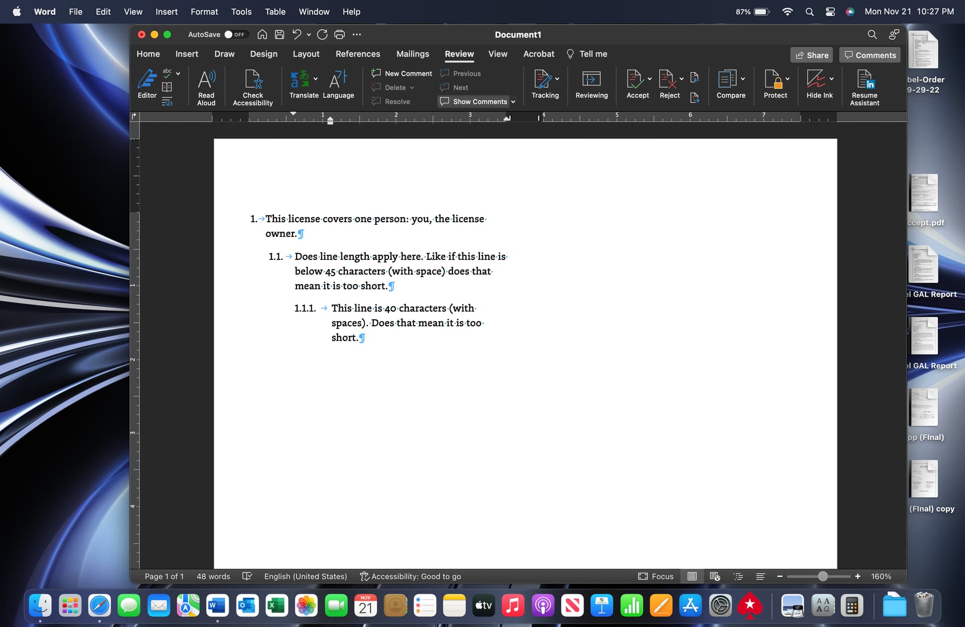
First, in a contract where the terms are all numbered, does the 45-90 characters (with spaces) only apply to the main para numbers or to the main para numbers and all sub-para numbers independently.
Line length is also confusing because in the screenshot posted the first line in para 1 is shorter than the first line in para 1.1. I know this is due to the word owner dropped to the next line in para 1, but does this matter if, after doing the alphabet test the line length is within the range? Also, when I do the alphabet test in para 1 the line length is 3 characters shorter than it is with the sentence shown in the screenshot.
Any formatting tips to get good line length when formatting this way?
Any thoughts you can give @mbutterick would be appreciated as well.
Thank you. I definitely was overthinking it lol.
Also, I did pay for Capito and have been loving the result. It is kinda an adjustment to hit the bold style v control B on my Mac but you do see a difference esp with bold. Control B looks more smudged if that makes sense v the true bold made by a font designer. My next step is to buy @mbutterick fonts. Now I know why you buy multiple to use them for diff purposes. However profess fonts are the way to go.
I emailed him about style linking and got no reply. I wanted to buy before the price went up because there were still features missing base on update notes. $100 based on other prices for prof fonts was a good deal considering I don’t have a use yet for small caps and other missing features.
Yes. Except now I like the old style figures for all numbers now except for numbered paragraphs. For some reason, they look better than they do on a free font.
1 Like
Thank you for the info. I looked, and his response was in my spam like you said. He did offer to email me a style-linked version; however, I told him that I could wait since I have adjusted to using the style. Still was nice for him to offer.