Hi, my name is Justin.
Let me start by saying that I use Typography for Lawyers as a reference every time that I draft anything for work, and the book as helped my typography tremedously.
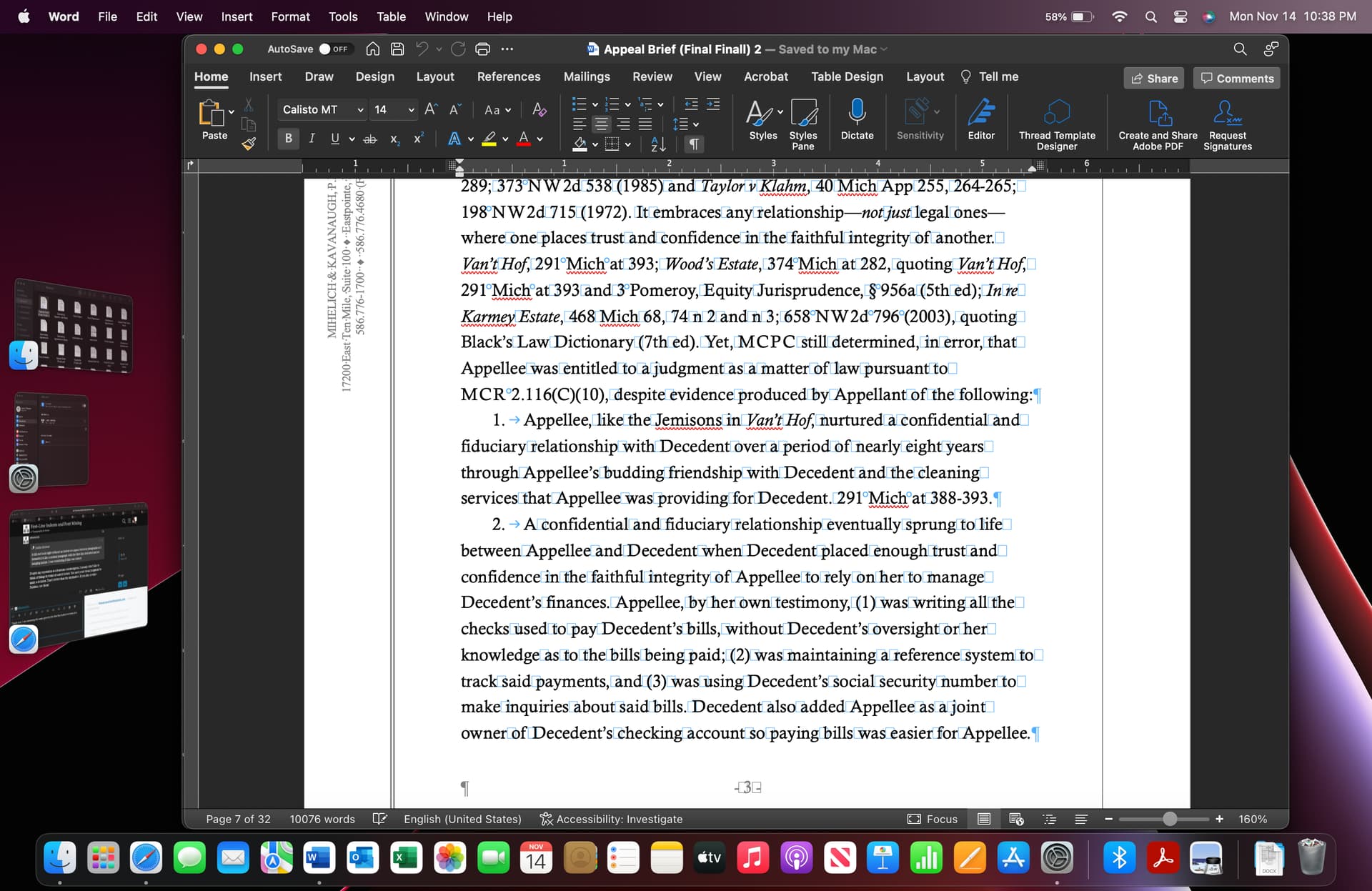
I did run into a typography issue when I was drafting my first Michigan COA brief. When drafting my introduction, I made a numbered list of reasons why a certain relationship existed in my case that was important for the appeal. I was also using first line indents instead of space between paragraphs. When doing the list, it did not look right without an indent or a space between paragraphs so I formatted it like a normal paragraph with the first line indented and no hanging indent. I was wondering if this was correct from a typography perspective or if I should have used a hanging indent with a space between each numbered paragraph, despite the rule to use either a first line indent or space between paragraphs, never both?
Second, I have been using the Avenir font for argument and fact headings in briefs and for headings in other documents and Palatino for body text. Do these mix well? I like the look of a san-serif font used for headings with a serif font for body text but I am new to mixing fonts in this way. Also, does MB have a san-serif font that would be good for this purpose?
Despite my reputation as a fearsome rulemongerer, I usually don’t like to think of things in terms of correct or not. You used your visual judgment to make a decision. That’s better than the alternative. If you like Avenir + Palatino, use them!
2 Likes
Thank you. I am assuming the same goes for formatting a numbered list as shown in the screenshot?
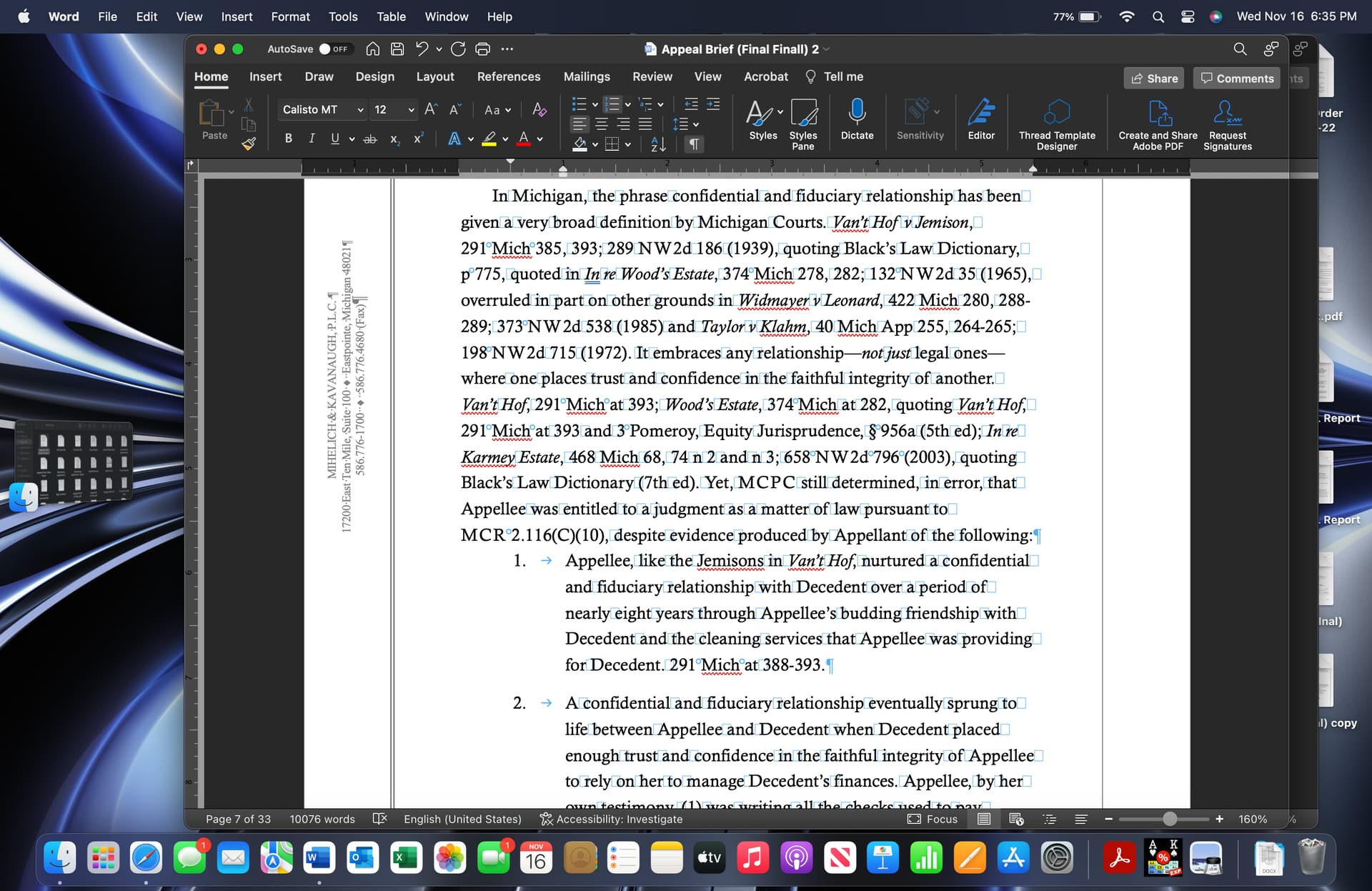
No. it follows a regular, non-numbered paragraph. Here is a screenshot that shows the preceding paragraph.
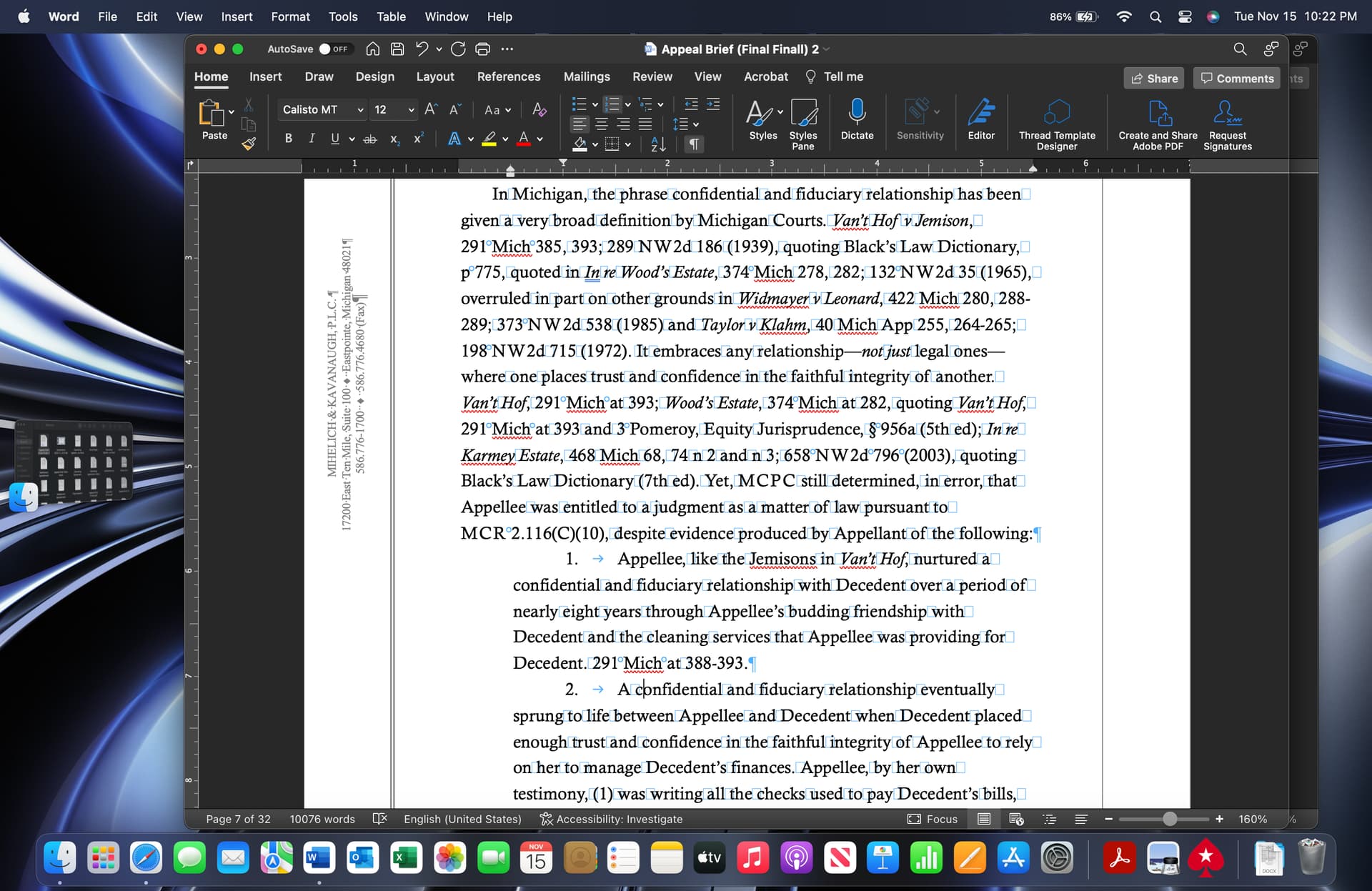
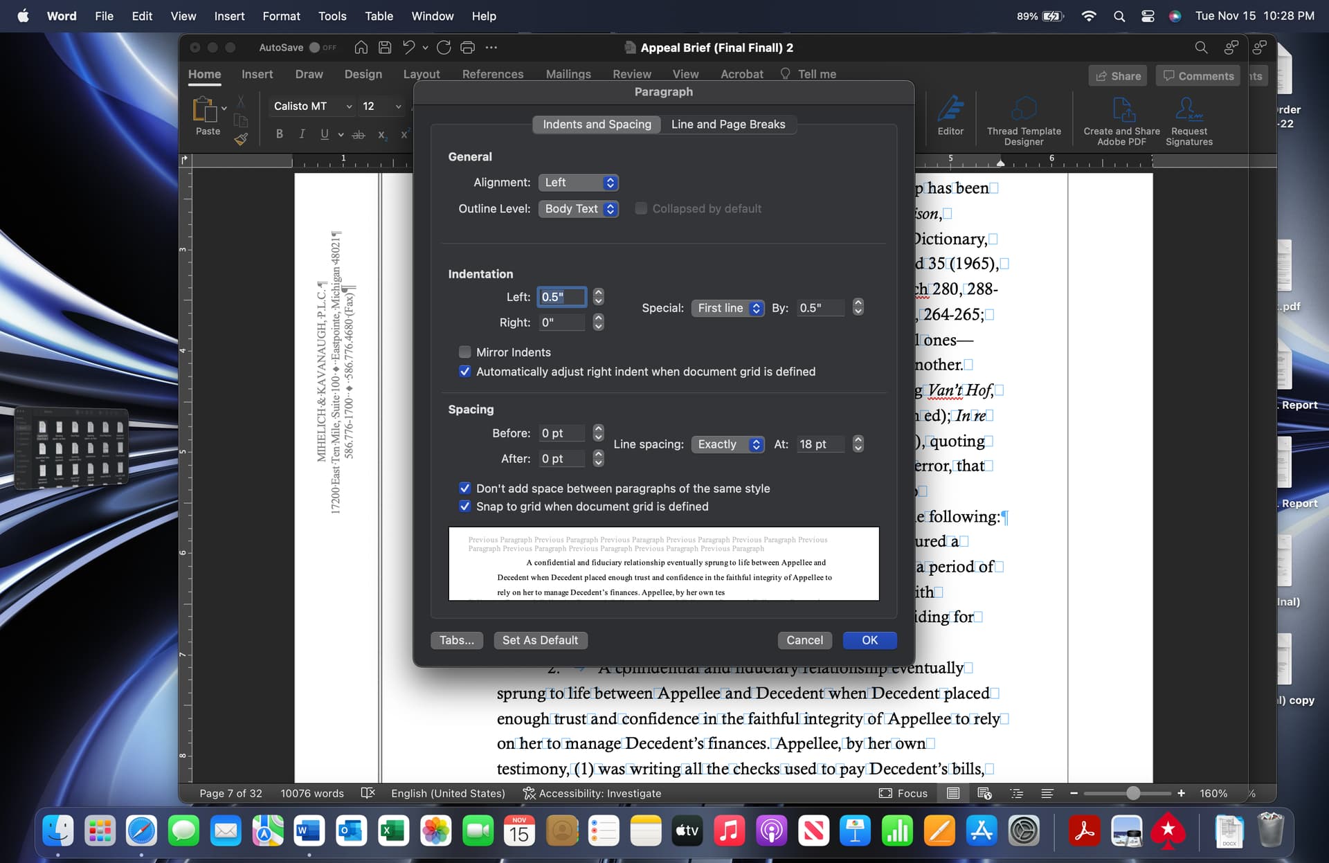
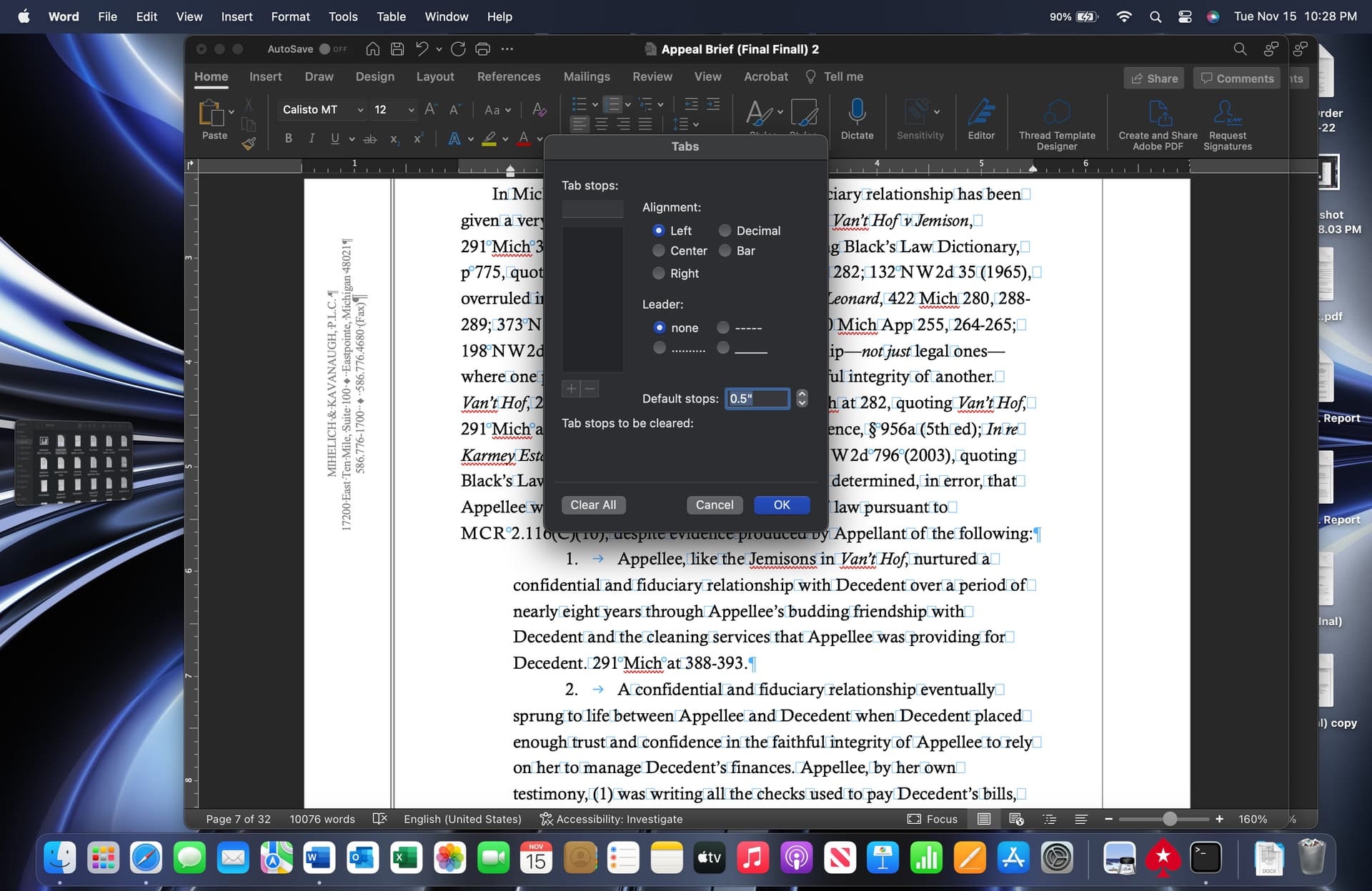
Is this what you mean when you say to set Align at to 0.5"; Tab space after to 1"; and Indent at to 0.5"? I put screenshots what I thought it meant and of my paragraph settings. I may have set it wrong.
I also have not learned to use styles yet. I would like to learn anything that will make formatting easier lol.
You don’t think that 0.5 creates too much space between the single-digit para numbers v 0.35 or 0.4? Just a curiosity question as I am also trying to train my eye to see when I have too much space in such lists and when placing a first line indent as I am assuming font size will also dictate the size of the indent.
There should have been a semicolon v a comma in item (2). I missed that when formatting. I was probably delirious at that point in the process and was just ready to submit at that point lol.
Also thank you for taking the time on this. It is greatly appreciated.
1 Like
I think I got it by doing it under the numbering settings, which to be honest did not know you could format all of that in those settings. I have attached a screenshot.
I will definitely adjust my settings which is perfect timing because I am finalizing an LLC operating agreement.
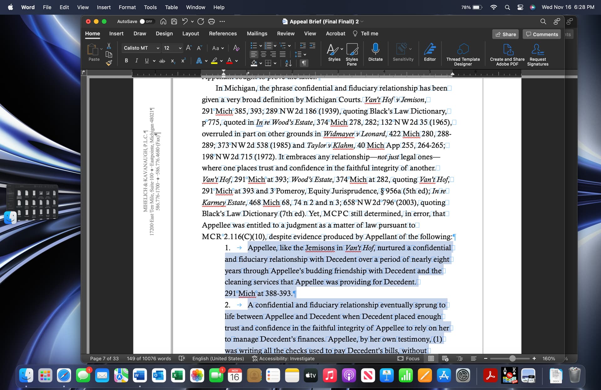
If the numbered paragraphs are formatted as shown, do you need space between paragraphs or no because of the space between the numbers and the meat?
Or does it make sense to break the rule of either First Line Indents or Space Between Paragraphs in this instance and format the numbered paragraphs as shown in this screen shot?
The added white space study makes sense. I wish that I didn’t have to use the advertisement in the margins so those were left blank. Ever since I read the book those seem distracting and unnecessary advertising.
I am also going to learn how to use styles. Any resource that you thought was particularly helpful to learn how to use those?
1 Like
You have a good eye for the spacing. My line spacing was set to 18 points. MI COA is pretty forgiving on formatting by only requiring min page margins and min font size and using a max word count rather than a page limit, but the Court Rules are strict on the 1.5 line spacing.
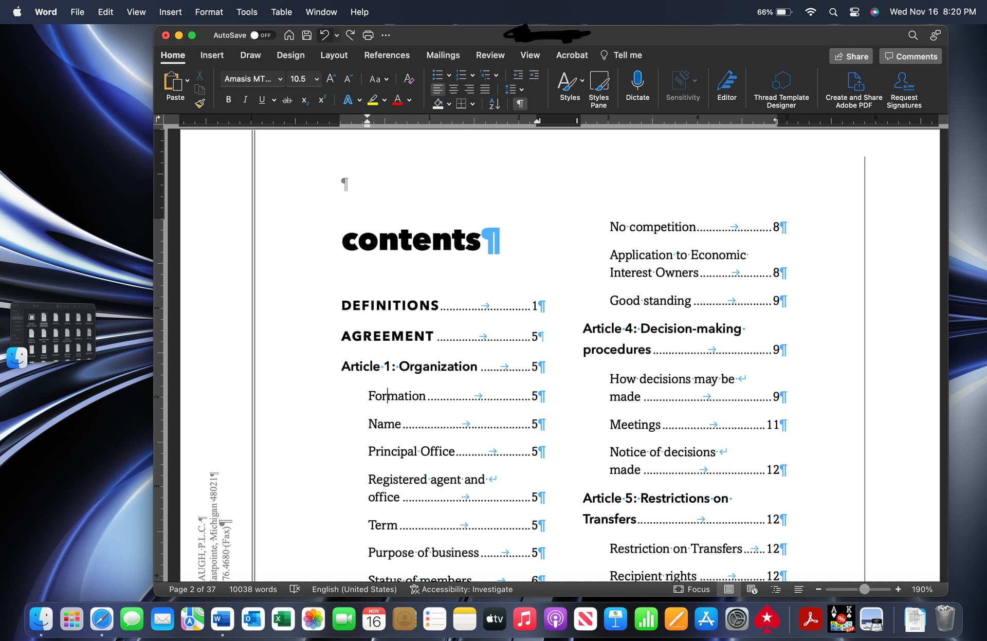
The outline numbering to me would work in a Complaint or Answer where your paragraphs are all numbered. I will be experimenting with this when I do my next Petition or Complaint. I love the process of experimenting as you can see from this screenshot of my TOC for an operating agreement.
I didn’t change the First Line Indent only because I was messing with the number paras to understand your feedback. I would otherwise make it match the numbered paragraph.
Do you use a prof font or system font and regardless which is your font of choice?
1 Like
It isn’t the norm in our lower court rules. Those still have page limits to motion briefs, but the nice thing is that the page limit is determine in 12 point, double spaced text, but most judges do not require or get upset at single-spaced pleadings, nor are they strict on the page limits at least the Judges that I regularly appear before.
Thank you. That TOC took sometime to adjust, but I am finally happy with it.
I agree. I love the creative aspect of trying to add good, creative typography to legal documents. Here, everything is in Arial or TNR; headings and titles are bold, all caps, and underlined; paragraphs are in bold or italics for emphasis; and paragraph indents are not consistent.
Your pleading looks awesome set in MB Fonts. I like that the block quote was set in a different typeface, which actually brings up a question, as I was experimenting with the same approach to answers to Interrogatories by setting the answers and objections in block quote format with a different typeface.
I am definitely going to buy MB fonts when and if I go on my own. Right now, jumping from my MacBook to my work PC, I am stuck using system fonts that I have on both operating systems. If I go on my own, my goal is to find a monospaced font that maybe a good old English style font for a Will to see how it looks to make it look like an old style will.
My firm does not frown on commercial fonts. I honestly did not think about having them on my laptop and my work computer. So that is a fair point, and I will go and look at them to see which one I would prefer. I am liking Heliotrope.
I would use the Blackletter as the title or just to say Last Will and Testament and then use a monospaced like Pitch for the body text.
1 Like
Dang. I just saw that Concourse Index that was free and I could have used that for my numbered lists in that brief lol
1 Like
Thank you. I will be finding a way to use them. Have you used them in Court pleadings yet?
1 Like
Yeah it ends at 99 lmao. I tried to see if I could edit them to make 4.1. lol
1 Like
What are your thoughts on the system font Amasis MT Pro? I just started using it, but it does not show up in MB’s Font Rankings in the book.
I didn’t realize it was a slab serif. Does MB have a slab serif?
This font shit is nice. https://vllg.com/mckl/shift
I like the sweeping serifs on the top of letters. $300.00 is steep tho.
I did mean shift lmao. What is a glyph? Is that the sweeping serifs?
I did check it out and Archer and Sentinel caught my eye so far. There are too many good fonts out there lol
I get that. I am not yet able to discern a bad font yet. I mean, I tried Courier New on a deed and liked the way it looked. So, I really want to learn what to look for. For example, when you say you prefer the capitals to the lowercase glyphs on Shift do you mean the letters, and if so, why? It would be nice to know if there is anything specific or just a preference.
Also it is pricey. Some fonts are very cost prohibitive. For example, I love Rooney Pro by Jan Fromm but it is $500.00 for the font family.
I will check it out.
In terms of Rooney Pro, I discovered it because it is the font used in the body text of the book “Shaping Text”. MB recommended it in his bibliography if you were to get another typography book. But again, the price is steep for it. In terms of MB fonts, I really like Valkerie and for headings, Concourse for sure.
On shift, if you do the test, I like the schoolbook a, g, and y. Not sure if the quotes are curly or appear more straight. That’s one thing about Palatino that I hate. I hate the way the quotes look. They look to straight for me.
When buying a font like Archer from Hoefler & Co, what font package do you pick?