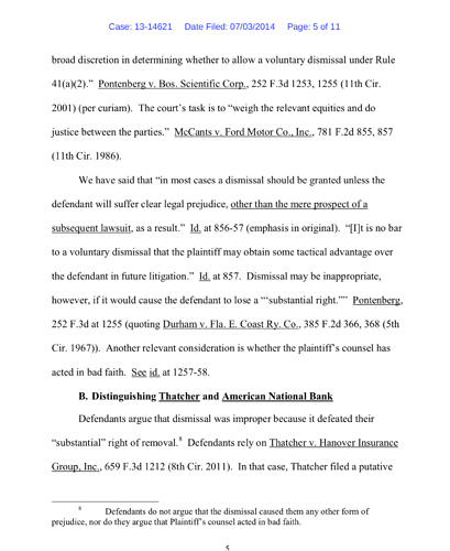
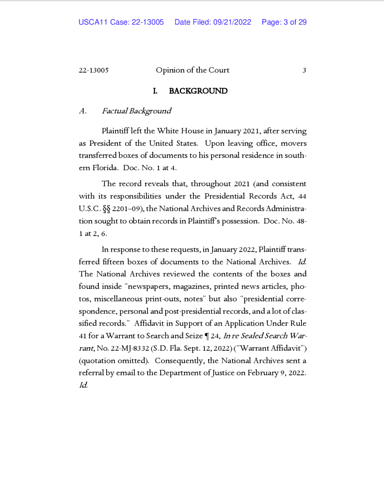
This opinion used the Dante font for the body of the opinion. I really like this font. I have not seen it before. Its available on Linotype.com
I also notice the court didn’t use the Dante Italic font - the Italics are just slanted text.
The good news: they’ve improved their typography choices since 2014, including font, page margins, and line spacing.
The bad news: as you say, true italics are missing (as are true bold styles and small caps). They’ve also taken a step backward in production techniques, as this PDF seems to be a “print to bitmap” situation resulting in gritty type, poor spacing, and a 2.5mb file size. (Here’s the correct method.)

